
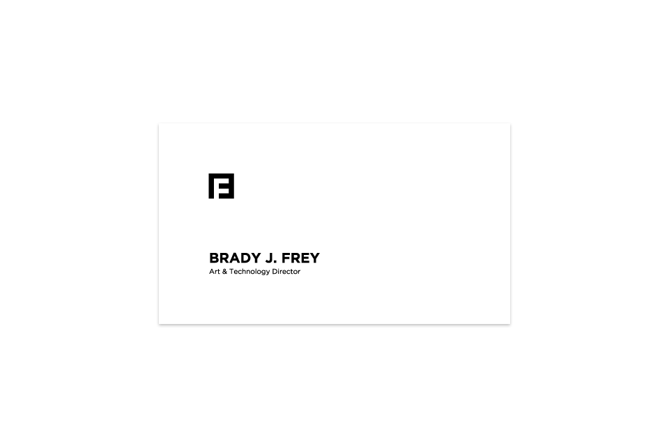
Is it a B? Or is it an F? It’s, possibly, both.
Creating your own identity is often the most troubling: you are your hardest client to please. I set out to treat my own identity in the same methodology I’ve practiced for my clientele. Reviewing my body of work, target audience, and evaluating the reputation I wanted to convey– I worked a design that was subtle, simple, modern, and yet focused.
The thickness of the lines are consistent throughout, with the length only adjusting to connect the longer corners of the shape. While most folks will instantly notice an F, they may notice the subtle, modernist B that contains the letter. The play on positive and negative space, coupled with a mathematically balanced construction, displays my obsession with detail, coupled with my desire for refinement.
The piece is intended to be bland and complicated, rigid and yet flexible to most forms of design. It is intended to convey, as an artist, I have my own style, while as a designer I am pliable to an intended media.
For the record, though, this one isn’t half bad either.