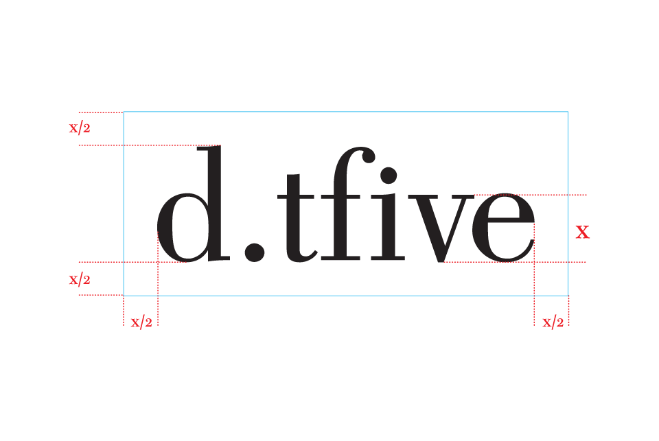
Bodoni – a classic type: The dotfive logo itself is an adjusted variation of the font ‘Bodoni,’ specifically the book variation (you may read a little more about the history of Giambattista Bodoni at Linotype Bodoni History). Bodoni is an uppity font, if uppity is a virtuous description — mathematically, it is a rigid and ‘perfect’ font, with curves and thin serifs that denote a brief connotation to the sensuality intended to appeal and entice. It is elegant and strong, but approachable, inviting, empowered.
It is, however, an aged and historical font — created at a time when, well, legible serifs were not desirable in a world of new graphic design. And it holds much history as a poster, title font; it’s poorly suited for body text. But its class is well known, and often has a subliminal appeal to many readers who aren’t as obsessed with typography.
As far as typography goes, the kerning of the font has been adjusted considerably — as you can tell most easily with the lowercase ‘e,’ whose space now overlaps with its neighboring characters (lowercase ‘f’ by default, always does).
The intention is to tighten the legibility of characters and to make the words feel integrated.The t was shifted slightly left; the dot on the i was shifted down to step away from the f; the v and e shifted a large amount left. The slight adjustments make the text feel proper, professional, and while the trained eye would notice, the average user may notice little, if anything. However, you should easily see that its more fluid in representation.