For the most part, symbolic representations of equality and tolerance have been adopted and redone more than a few times over. Even further, many of those symbols have been so interchangeable for the cause (equal sign, tic tac toe, plus signs, aquarius style squiggles, the triangle, the rainbow, etc) they sit desensitized to the average audience, sometimes politically biased. Couple that with Marriage as the foundation theme, and the spectrum of design runs into a vision of bells and doves that can easily overwhelm a Brand.
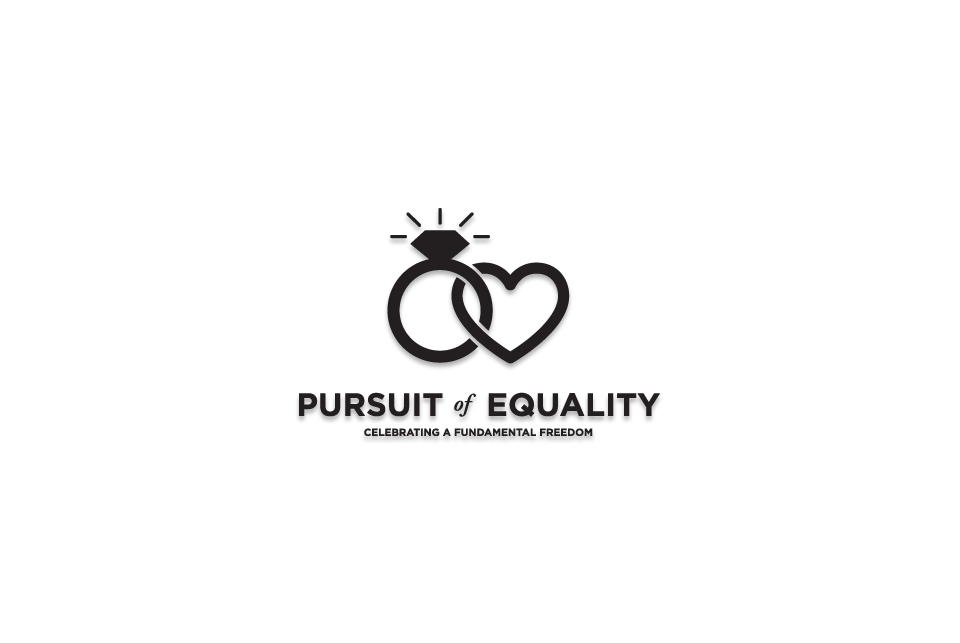
I tackled the project by dabbling in everything, and investigating their symbolic history: bells as hearts, hearts as bells, hearts as doves, equations as bells, bouquets as hearts (actually quite nice, I hope to recycle that someday), but the universal ring of marriage, intertwined with a heart seemed the most solid. Gently playing off the duality of marriage, the yin/yang balance of both opinion and personality, yet still nuetral in gender.
The type is a mix of the uniquely American and typographically perfect Gotham, popularized by the recent Democratic Campaign for Presidency, mixed with the traditional Adobe Garamound for grounded clarity (although, I claim to be doing the italic styling a long time before that Campaign took a media ride).
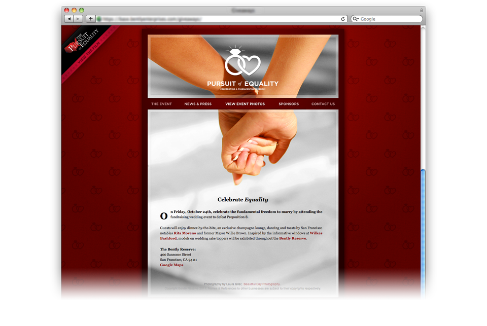
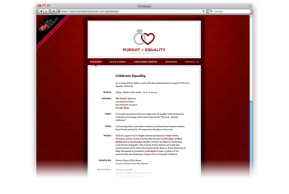
Stylized with the Brand" title=“Pursuit of Equality: Brand in mind, the Pursuit of Equality website is a handicap accessible, standards driven, tableless managed site. The clean code, coupled with the simple navigation helped it skyrocket on Google Search Rankings, and built off the “Wordpress”: platform to support an array of socially driven sites.
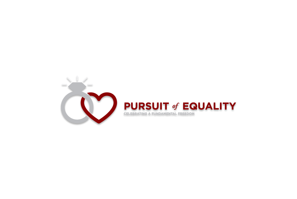
Due to design limitations, users of older browsers such as Internet Explorer 6 and under receive a toned down version of the site (although, they may never notice), including iPhone optimization for increased reach.