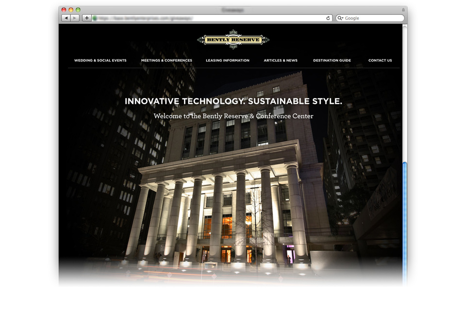
As the Art & Technology Director for the Bently Reserve, I was priviledged with directing the green restoration of the building to the period design, as well as integrating the latest technology. This also allowed me full control over branding from print to web.
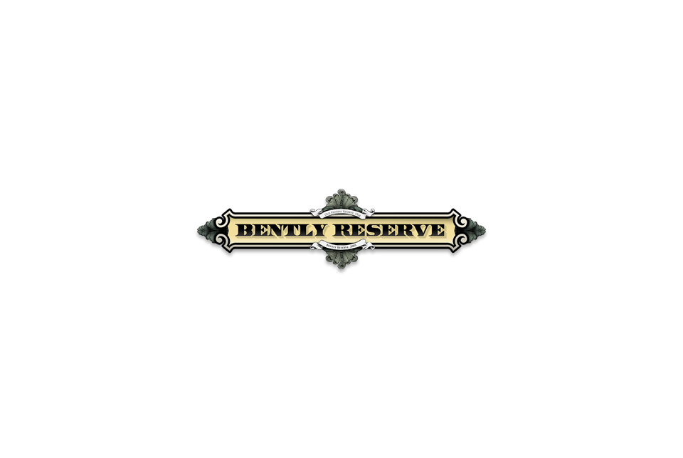
My original designs for the logo were similar to Bently Holdings to keep a unified feel, but the Owners were adamant that this building should have it’s own appeal, and I focused on the rich commercial history of the building. As a result, the logo is a hand drawn representation of the guillochéé found in bank notes, coupled with relief structure of the buildings interior design.
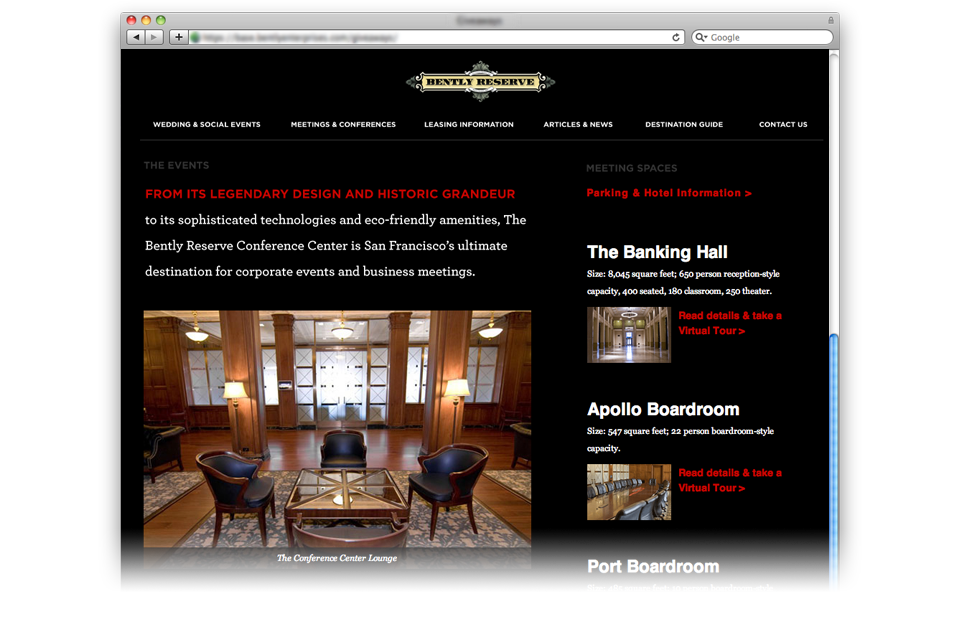
Subsequently, I’ve directed future print & web design to focus heavily on the beautiful grandeur of the building by letting the photography speak for itself, surrounded by balanced, clean, and dynamic art. The contrast speaks well to the modernization of the building guts, and the classical restoration of her exterior.
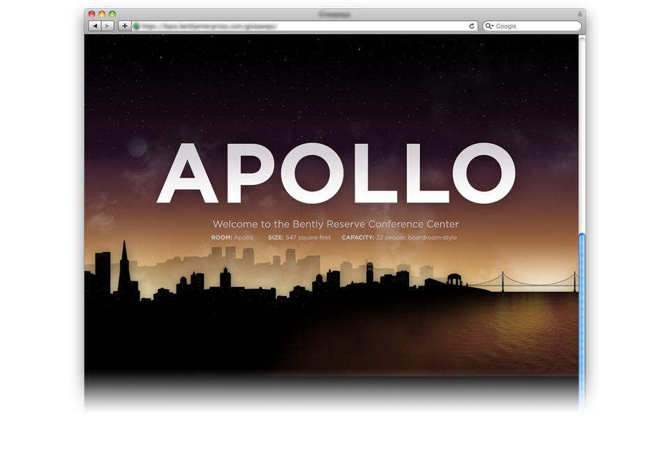
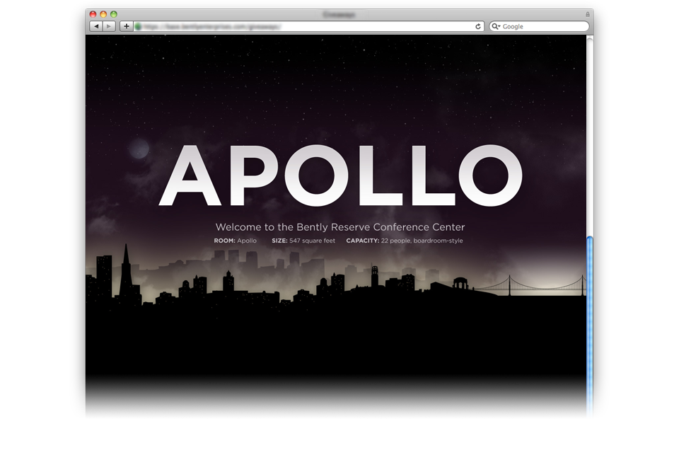
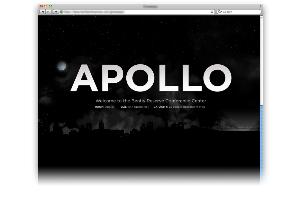
With this in mind, some of the graphics are for the dynamic signs of each Conference Center room (as the Apollo design above shows). While overseeing this renovation, I reviewed existing Conference Center Signs, and noticed a repeat issue: rooms named by staff mean nothing to new guests. As a result, although we name each room, the signs on each room are a custom graphic for the attendee. Managed by a remote webserver (with built in monitors that refresh on schedule) we can easily update room graphic on command, and tell staff that the room is the name of their company.